Album Cover Compare and Contrast
Album covers are a way in which artists are able to express their image before the consumer has even listened to the music. This means that it is an essential part of marketing, as it is a way to establish an artists star image.

This is the album cover for the band Tribes. They had previously released an EP album, but this was their first real album, thus it was an extremely important part in creating the bands image. Firstly, none of the band are looking at the camera, thus a distance is immediately created between the artist and the audience. This implies that they are more about creating music rather than the whole 'celebrity' lifestyle. The bands attire also adds to the image they want to create. They are all dressed in rather shabby clothes, which are ripped and have the appearance of being worn often. The bands music is alternative rock, and their clothes echo this genre, as they have the old rock and roll appearance. As a result, the audience is able to make connections between this band and others who are seen to dress the same thus the audience will be more aware of the type of music Tribes play before they listen to the album. This benefits brand awareness and brand image thus helps to entice more potential consumers, which boosts sales as well. Moreover, the band is sitting on an old bench with a dirty wall as the backdrop. Again, this coincides with the image of the bands genre thus helps to establish the idea that the band have a relaxed attitude towards the industry in which they work.
The text on the album is also an important part of the cover. The text is all about promoting the band, rather than the album. This is because, as their first major album, the band need to advertise themselves first, and then their music. The big bold text catches the eyes of the consumer and helps to familiarise them with the name of the band. This contrasts with the small text of the title of the band, which reiterates the idea that the band and the management team behind them want to promote the bands image rather than the music.
Overall, the bands album cover has an authentic feel that links to their genre of music which helps to establish their star image. The band is organic and this helps to emphasise their rock and roll look.

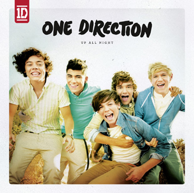
This is the first album for the now worldwide sensation that is One Direction. The band is synthetic in the fact that it was set up on the show 'The X Factor' thus are a complete outcome of Simon Cowells wishes. The band have been designed by management, thus the album cover is all about promoting this new up and coming band that had already started building a wide fan base during the shows duration.
The band are all looking at the camera thus are making eye contact with their potential audience. This establishes a link between them and their fans, which helps to generate the idea that the stars are present in the everyday life of their audience. All their faces are shown, and their clothes are all clean which creates a 'preppy' atmosphere. The band is promoted in this way, due to the fact that their target audience is young girls, thus the management team behind One Direction need the bands first album to establish the star image for the band that these girls will relate too. The boys are young and all are shown to be laughing. This youthful playful image is vibrant and creates the star image of good young boys who are having fun.
From a photographic perspective, the image has been slightly faded to give it a soft warm feel. This echoes the genre of the music, which is pop, and again reiterates the good image the band represents as their management wish them to become role models for their audience. Thus there is no sexual aspects to the image, or stereotypical negatives, such as tattoos, alcohol and cigarettes. This is purposefully done in order to attract the right target audience.
The text on the album, like on the Tribes album, is all about the bands name. It is in large bold font, and the black stands out against the soft tones of the image. This therefore makes the name, One Direction, stand out and as this was the first album, helps to promote the already known brand name. The text seems to be in a font that looks hand written which again creates the mood of youthfulness amusement. The album name is small, and although in capitals, does not draw attention away from the bands name. This confirms the idea that the album cover is all about selling the band, rather than their music genre.
No comments:
Post a Comment