Saturday, 16 November 2013


KYLE COOPER EXAMPLE NUMBER 3:


Kyle Cooper also helps to design adverts. 

KEY FACTORS:

  • The music used in the advert is happy and uplifting thus making the product seem more desirable and intriguing. Also, as the song is about pictures it connects with the product further. 

  • The setting is in a messy home environment, therefore implying to the audience that this product can be used anywhere and by anyone. 

  • By bringing the frame up to his face and then the image appears, shows the skill of Cooper's editing and makes the audience believe that getting the image is instant, which is exactly the idea HP want to sell. Also, as the images are fun faces so adds to the upbeat advert.

  • The large writing that comes across the screen of "You are your own photo opportunity" entices the audience in. The word "YOU" is larger than the rest as is bolder, therefore makes the advert personal to the watcher. The switch from "YOU+HP" to the black screen with the companies logo, again shows Cooper's skill of editing, and connects the product with the company. 

  • Also, there are many parody videos of this advert, which shows that many people were excited by the advert and wanted to know if they could do the same thing at home. Therefore, this increases the interest in the product which is exactly what HP wanted thus Cooper did his work very well. 

I enjoyed this advert. It conveys the right amount of information in its short time period, while also being uplifting and interesting to watch. 
KYLE COOPER EXAMPLE NUMBER 2:
 

Identity is a 2003 horror film, directed by James Mangold. 


KEY FACTORS:

  • The music here is key as it creates suspense and creepy atmosphere, which makes the audience begin to feel uncomfortable the moment they start watching the film. The diegetic sound of the tape recorder being wound forwards and backwards again is unsettling to hear, thus adds to the ominous atmosphere. The non-diegetic sound of the patients voice, makes the audience ask questions on what the man looks like as they never see him but only hear his voice through the tape recorder. The sound of thunder here also adds to the thrilling atmosphere and makes the audience feel on edge. You hear the thunder before you see anything, so automatically draws the audience into something eerie.

  • There is a mixture of long duration shots and then a series of quick cuts to show snapshots of images in order to entice the audience. The long close up shots of the tape decks introduce the audience to two characters so the audience can piece together information on Malcolm Rivers and Dr. R. Mallick. As the tape decks are in focus and everything around them is blurred, it shows that the audience should be contrasting solely on the tape decks, thus signifying their importance. The moving shots of Malcolm's mug shot and what is implied as his childhood drawings, confuse the audience and make them assume that Malcolm has some deep psychological issues. The sound of sinister laughing combined with a close up shot of the drawings Malcolm made imply that something terrible happened to those "stick men". 

  • The match between the dialogue asking about Malcolm's mother and the images of her, imply that she was not a good parent, and has added to Malcolm's issues. The close up shots on the mothers mug shot and words such as "prostitution" "possession - drugs" and "parole violation" also build up the idea of her as a terrible parent. The multiple cuts of newspaper clippings and State reports again gives background into Malcolm's childhood and the extreme close ups used allow the audience to really see and read the terrible things that happened to him. The close up on the mug shot of Malcolm is the only image of him the audience see therefore adds mystery to the character. 

  • The font used for the credits is small and neat and is also the same font used in the doctors report which links them together, hinting that the film will involve doctors and they will be important to the font. The credits come up in slow succession throughout the opening scene, but it is the shots that are the main focus for the audience, therefore the credits could be missed. 

  • The lighting through out is dark and muted, adding to the creepy atmosphere. The use of lightening unsettles the audience as the sudden flashes of bright light over the doctor add an edge of danger to the scene. 


  • The close up shots on the photo's of the dead people bring a harsh vividness of colour to the scene thus highlights the savagery of the murders. Also, the extreme close up on the word "evil" shows the audience that someone took pleasure out of these murders, and the audience are hinted to believe that it was Malcolm. 

  • The newspaper clippings titled "Renowned Psychiatrist to Testify for Defence" suggests to the audience that the doctor is trying desperately to figure out what is happening inside Malcolm's head in order to prevent him receiving the death penalty. It also shows that these images are in the present and that this case is still going on. The extreme close ups of the doctor show his interest and confusion in what he is reading and listening to, therefore hints to the audience that he is heavily involved in the case. 


I have mixed opinions on these opening credits. By combining all the horrific images of Malcolm, his mother, the murders and the newspaper clips with the voice over really creates a suspicious, creepy and sinister atmosphere. However, the opening credits are lost as the shots are far too detailed and interesting therefore the audience miss what is written in the credits.  

Friday, 15 November 2013

Example's of Kyle Coopers Work


KYLE COOPER EXAMPLE NUMBER 1:


Guy Ritchie's "Sherlock Holmes" 


KEY FACTORS:

  • The font -
- Goes in tone with when the film is set. Changes colour from white to black in order to ensure that the audience can read the writing clearly. Is large enough for the audience to read easily, but does not distract from the images behind. 

  • The Background
- A cream background allows the images to be seen clearly, while again keeping in tone with the setting of the film. Paper during this time would have been old and faded so fits exactly with the piece.


  • Takes key moments from the film, freezes them then transfers them to drawn like images. 

- This co-insides with the time the film is set in, so matches the context of film. The muted colours of the drawings, occasionally splashed with vivid red allow the audience to consider the image and the writing beside it. Also, by taking images from the actual film the audience is reminded of certain parts that were particularly good, so leave the film with the best parts in their mind. The images are moving slightly, so gives the impression of wet ink drying so again matches the period of the film.

Example: 

- The drawings allow the audience to connect actor with what part they were playing, so if they did not know the actor before, they have time to find out. The shots are held for a long time period therefore letting the audience read the writing. 

Example:


  • The main actors of the film are given their own recognition. This promotes them as the leads and also lets the audience appreciate them specially for their performance. 
Example:
 

  • The music is the theme tune associated with the film, so creates the desired atmosphere of mystery and suspense while still being upbeat. 
  • First credit is Guy Ritchie, so highlights to the audience who directed the film so can appreciate their work first.
  • Some of the images co-inside with what recognition is given. For example, the director of Photography is shown next to an image from the film with a man with a camera.


I like these end credits, as they are not a dull list of the names of actors, directors and producers but instead are exciting snapshots of the film so interest the audience to actually stay and watch the credits.


Wednesday, 13 November 2013

Kyle Cooper Research


Kyle Cooper


Kyle Cooper was born in 1962 in Salem, Massachusetts USA.

Kyle studied graphic design at Yale School of Art under Paul Rand and achieved and M.F.A. as well as a BFA from the University of Massachusetts. 

Kyle is mainly a desginer of opening title sequences, but also of adverts and has been a director too. 

He has directed over 150 films titles and and VFX sequences, while also directing a feature film, 'New Port South'. 

His most memorable film titles have been, Se7en (1995), Dawn of the Dead and Spider Man 3

Se7en  is seen to be a ground breaking title sequence and has changed the way title design takes place today. New York Times Magazine called it "One of the most important design innovation of the 1990's".

In 1996, Cooper co-founded Imaginary Forces which is a creative agency and production company.


In 2003, Cooper founded Prologue Films from which he has created title sequences for the The Incredible Hunk, Final Destination 5 and The Walking Dead. It is where designers, film-makers and artists all come together to create something exceptional. 


Kyle Cooper has won the  Primetime Emmy Award for Outstanding Picture Editing For Short-Form Segments And Variety Specials and has been nominated for the following:

  1. Primetime Emmy Award for Outstanding Main Title Design
  2. Primetime Emmy Award for Outstanding Multi-Camera Picture Editing For A Miniseries, Movie Or A Special,
  3.  Primetime Emmy Award for Outstanding Film Editing for a Special
  4. Satellite Award for Best Visual Effects
  5.  Sports Emmy Award for Outstanding Graphic Design
Cooper also holds the Honorary Royal Designer for Industry from the Royal Society of Arts in London. 


Sunday, 10 November 2013

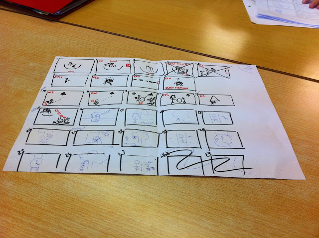
Beginning of Story Boarding


First Draft of Story Boarding

Our group began story boarding in order to get some idea of the shots we were going to use, and how we were going to piece them together.  


This was our first very basic draft that we started with. Here we came up with very simple ideas of how we were going to put the shots together and in what order. From this we developed our idea further until we ended with this.


Here we focused closely on each shot and what it would contain.
For each shot we discussed:
Location - where the shot will be set, which we narrowed down to three places; a bathroom, a woodland area and a corridor
Action - what occurs in that specific shot
Shot/movement - what kind of shot we are going to use, and if were are going to pan/tilt/rotate during the                                 shot
Sound - what sounds we want to be heard - diegetic and non diegetic
Lighting - how the shot will be lit - we decided to have natural lighting through out
Edit Transition - how we are going to piece together the individual shots
Timing - how long we are going to hold each shot

We will develop each of these sub topics further until we have a clear outline on what each shot will entail.


Our group was happy with our first story board as it showed that we could combine our two ideas and that they would work together well. 

Friday, 8 November 2013

Production Meetings


Our group enjoys our production meetings even though we do have some heated debates over ideas.

We finally settled on an idea. We decided to combine both mine and Archie's idea. So our opening sequence will now entail having a politician washing his hands vigorously in a sink and then walking down a corridor, signing some papers and then walking out of the shot. During this, there will be cuts to  a young girl hanging herself and writing in her diary that this is not her first attempt of suicide.

The idea for the whole film is that the politician when he signs these papers is actually giving the girl the opportunity to attempt suicide multiple times.

It took us a while to agree to combine our ideas, but now that we have we are working well together on establishing what will be in each individual shot.